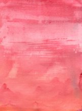


Above are various exercised tried out using wet in wet and wet on dry applications of paint
For this Exercise I was to use the dry papers from the last Exercise, make up the same colour mixes only this time paint the second colour over the dried wash that I set aside. I was to notice the different ways the colour behaved and make note in my learning log. For Example
Does this method give you greater control?
Have the colours merged in the same way?
How could I employ these techniques of building coloured glazes?
After I was to practices what I had learned with some of my other colours. I was to finish up by looking at Mark Rothko and the interactive tour with the Tate.
There are numerous factors that are involved in how this exercise goes, from thickness of wash, gradient of paper, type of paper, wet on wet, wet on dry. Wet on wet if done on a slant mingles with the second colour and you get happy accidents within the mix as can be seen within the previous exercise. How well it mixes does I have found depend on the colour pigment used. The most definitely don’t all act the same way, even within type of colour Ultramarine Blue is far more grainy and unpredictable than Cerulean Blue which flows more even when doing a wash.
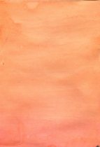
Working wet on dry is altogether different, rather than mixing and having a range of colours by merging mixes, you get a very vivid colour either end with a slight tint of the second colour and a gradation rather than a mix.
The exercise of wet on dry I tried out from my original paper didn’t work, I have no idea why although the orange over red worked better, the uptake on the paper was odd, it could possibly be because the paint was left in pots overnight and hadn’t fared well. However the orange and red both contained Alizarin Crimson a colour which didn’t work as well with the previous exercise. However I tried out numerous sheets of various applications and paper some worked some didn’t. I think Acrylic this watered down is far more unpredictable than watercolour paint, however like watercolour it does work better on watercolour paper. I painted one sheet of watercolour on some old watercolour paper I had and it works so much better when applying as a glaze, the piece I painted was wet in wet and can be seen second from the left top line.
Above are a selection of some of the exercises I have done including the two original ones that didn’t work.
Wet on Wet and Wet on Dry applications will have their different and similar effects which could be used for various reasons especially where a gradient is needed or wet in wet gives a feathery look which would be good in skies, petals, water whilst layered washes can give a glow from an under colour that just can’t be got by a single colour it adds depth and texture and will be able to be used for various reasons, like stone, paintwork, sky and so on.
I looked at Mark Rothko and whilst his work is not something I particularly like I must say after the exercise I can see the fascination on his use of colours.
